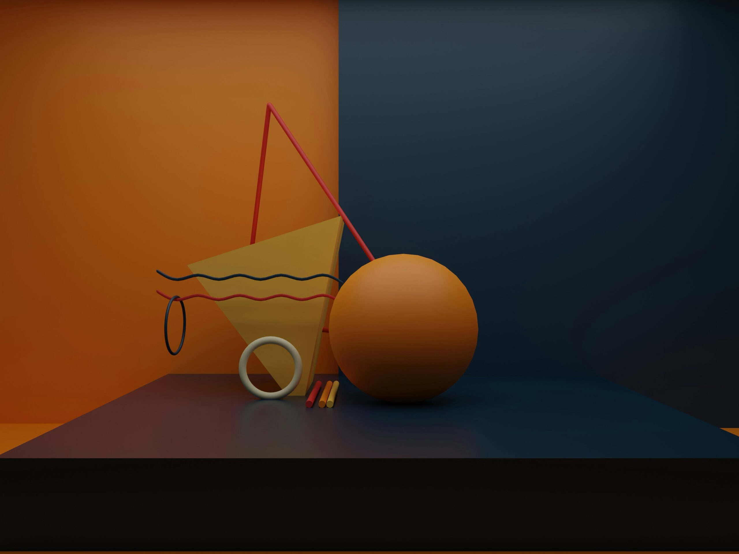
Color theory in fashion photography, significantly influencing how images are perceived by viewers. Understanding the nuances of color—such as how different hues interact with one another, the emotions they can evoke, and the harmony they can establish—allows photographers to elevate their work from mere snapshots to stunning visual art. By mastering these concepts, you can create images that not only capture attention but also resonate deeply with your audience. Here are five essential ways that color theory can transform your approach to fashion photography.
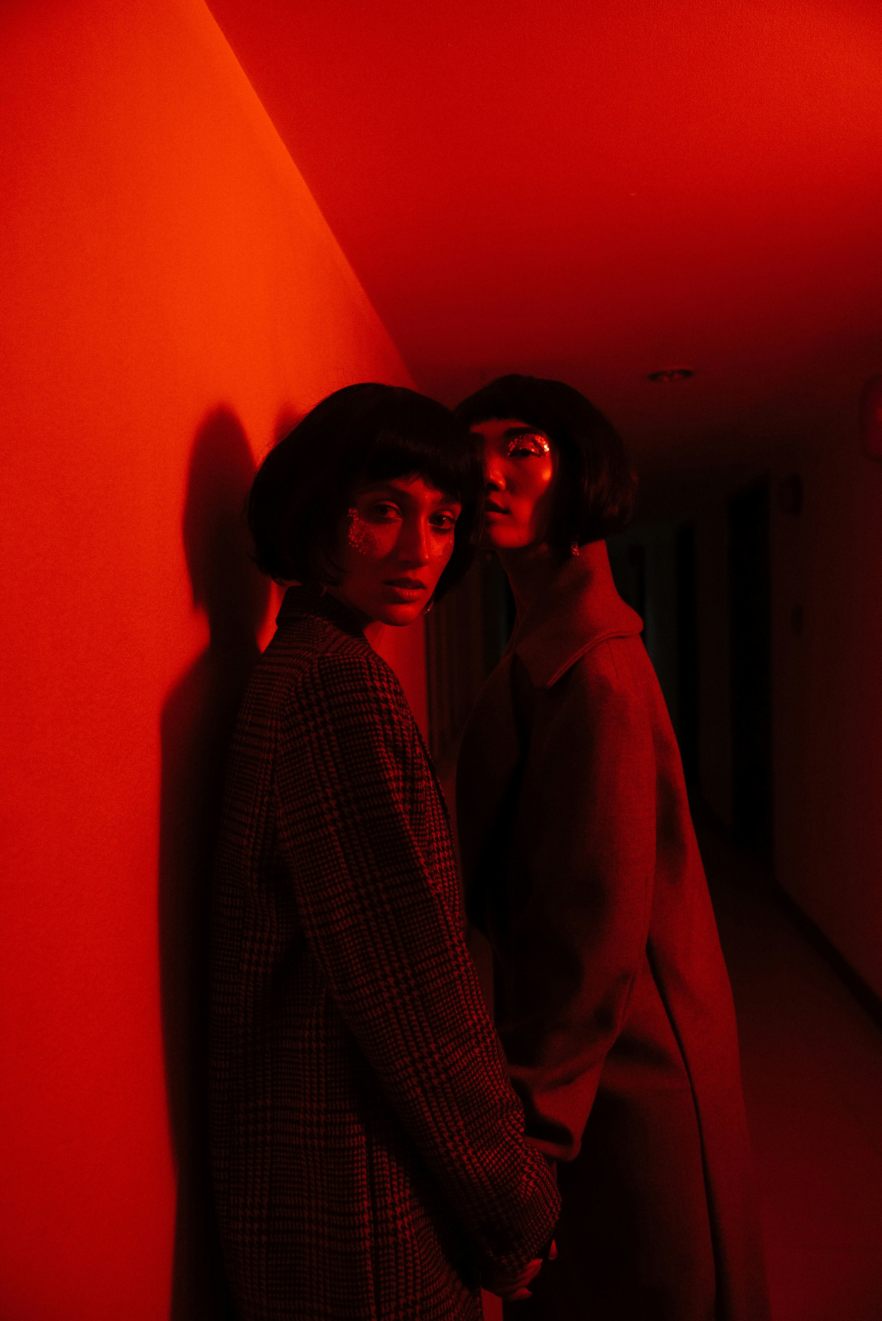
Photo by JC Gellidon on Unsplash
Color theory in fashion photography
1. Emotion Impact of Color in Photography
Colors have a remarkable ability to evoke a wide range of emotions, setting the tone for your photographs. For example, warm colors like reds, oranges, and yellows are often associated with energy and passion, making them perfect for dynamic fashion shots that aim to captivate the audience. In contrast, cool colors such as blues and greens tend to evoke feelings of calmness and tranquility, creating a more serene atmosphere. By carefully selecting your color palette, you can craft images that resonate emotionally with viewers, ensuring they are not just visually appealing but also impactful.
Example:
Imagine a high-fashion editorial shoot. If you use vibrant reds and bold pinks, the scene comes alive with excitement and energy, instantly grabbing attention. On the flip side, if you choose soft pastel shades like blush and mint, you create a gentle, dreamy vibe that evokes feelings of nostalgia and serenity. Your color choices can completely change the mood of the photo, making it feel fresh and engaging or calm and reflective.
2. Creating Visual Harmony in Photography
Color theory offers a solid framework for achieving visual harmony in your compositions. By utilizing various color schemes—such as complementary, analogous, or triadic—you can ensure that all elements of your photograph work together cohesively. A well-balanced composition not only looks more professional but also draws the viewer’s eye smoothly across the image, creating a more engaging experience.
Example:
Picture a photoshoot featuring a model in a stunning emerald green dress. To enhance this look, you might choose a background with analogous colors like soft blues and rich teals. This combination creates a harmonious scene where the colors complement each other beautifully, allowing the dress to stand out while still feeling part of a cohesive whole. The result is an aesthetically pleasing image that captures attention and invites viewers to explore every detail.
Color theory in fashion photography
Color theory in fashion photography
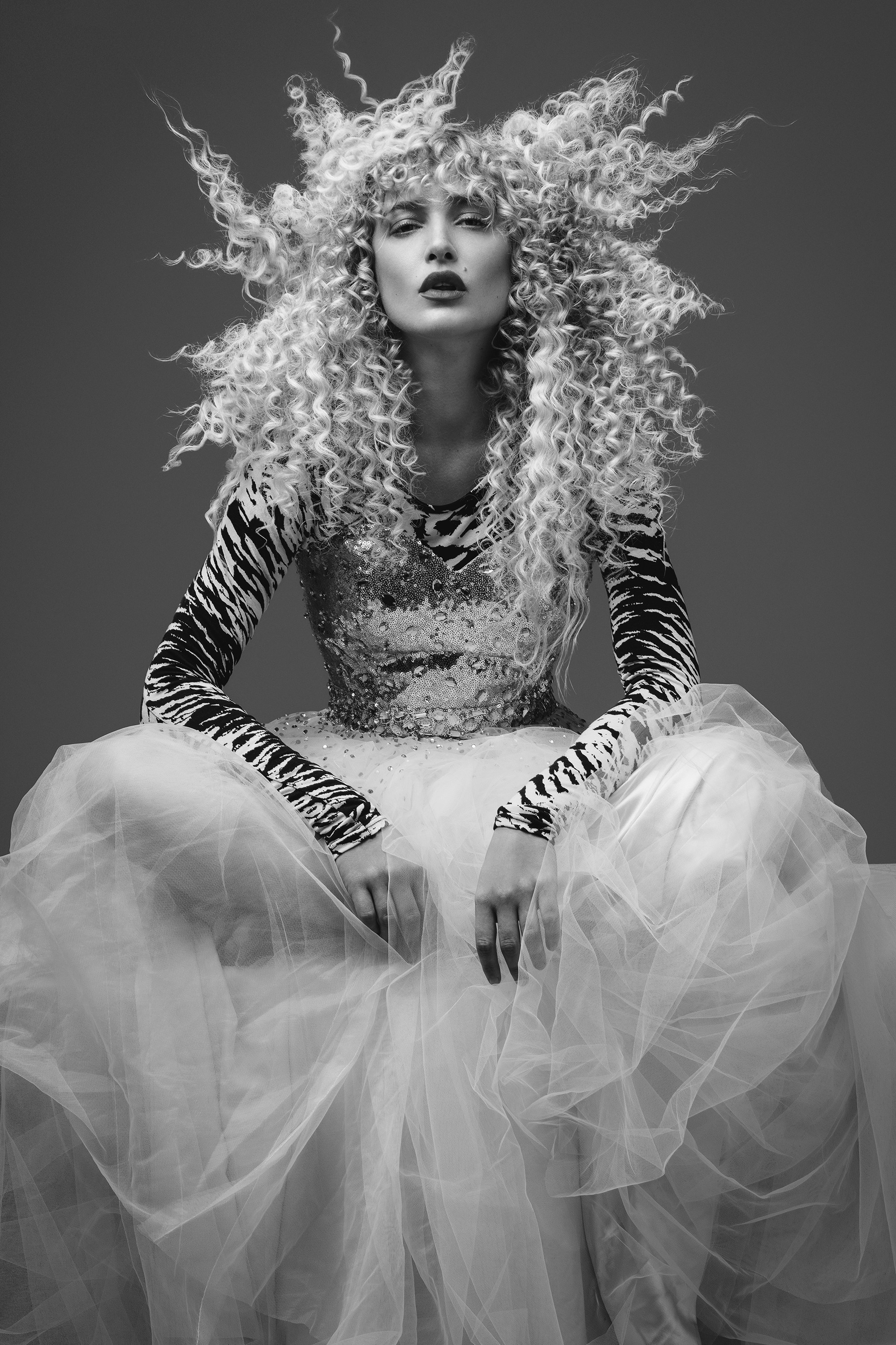
Photo by Ben Scott on Unsplash
3. Enhancing Subject Focus in Photography
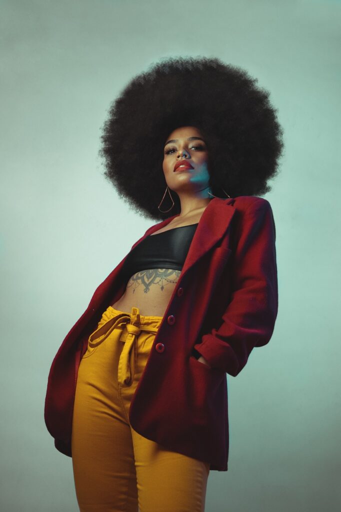
One of the most effective ways to use color theory in fashion photography is to draw attention to the subject. By carefully selecting contrasting colors between the model and the background, you can create a striking visual that makes the subject stand out prominently. This technique ensures that the model becomes the central focus of the image, guiding the viewer’s eye directly to them.
Using contrast not only highlights the model but also adds depth and dimension to the overall composition. It helps create a more engaging and dynamic image, inviting the audience to explore the details. By employing this approach, you transform a simple photograph into a powerful statement that captures both attention and interest, making the subject feel alive within the frame.
Example:
Think about a model wearing a bright yellow dress against a soft gray background. The bright yellow immediately catches the eye, making the dress the star of the photo. This contrast not only draws attention but also makes the outfit feel vibrant and lively. It’s a simple yet powerful way to create an engaging image that invites viewers to take a closer look.
4. Conveying Brand Identity
In the competitive world of fashion, establishing a strong brand identity is essential for success. Color plays a significant role in this process, as brands often have signature colors that reflect their core values and overall aesthetic vision. By incorporating these colors into your photography, you can create a consistent visual narrative that enhances brand recognition and fosters loyalty among your audience.
Example:
Take, for instance, a luxury fashion brand that consistently uses deep gold and rich black tones in its imagery. This deliberate color choice evokes a sense of elegance and sophistication, perfectly aligning with the brand’s identity. When viewers see these colors, they immediately associate them with the brand’s luxurious image, creating a strong and memorable impression. By using a cohesive color palette, you not only communicate the brand’s essence but also strengthen its appeal to the target audience, making the images resonate on a deeper level.
Color theory in fashion photography
5. Experimenting with Color Psychology in Fashion
Understanding color psychology offers valuable insights into how colors influence viewers’ perceptions and behaviors. Each color carries its own set of emotional associations, and different hues can evoke a wide range of feelings and responses. For photographers, this knowledge is crucial, as it allows you to thoughtfully consider how your color choices impact audience reactions. By leveraging color psychology, you can create more compelling and engaging imagery that resonates with viewers on an emotional level.
Example:
For instance, utilizing blue tones can inspire feelings of trust and dependability. This makes blue an excellent choice for brands that aim to build credibility and foster a sense of reliability with their audience. By incorporating such colors into your photography, you not only enhance the visual appeal but also align the imagery with the brand’s messaging. Thoughtfully applying color psychology can significantly elevate the effectiveness of your visual storytelling, transforming your images into powerful communicative tools that connect with the audience in meaningful ways.
Color theory in fashion photography
Conclusion
Incorporating color theory into your fashion photography can significantly impact how your work is perceived. From setting the mood and evoking emotions to creating visual harmony and conveying brand identity, mastering color usage enables you to create stunning and meaningful images. By grasping these five essential ways color transforms fashion photography, you’ll be better equipped to tell powerful visual stories that truly captivate and inspire your audience.
As you prepare for your next shoot, embrace the power of color. Don’t hesitate to experiment and explore different palettes—let color be your creative guide. You might be surprised at how much it can elevate your photography to new artistic heights!

