Do you ever find yourself looking at posters and designs and thinking you could do better? Do you notice issues with visuals that you encounter daily, and believe you have the skills to improve them? Whether you’re a budding designer eager to refine your craft or a business owner keen on enhancing your design knowledge, understanding common pitfalls is crucial. In this comprehensive guide, we’ll delve into 10 frequent graphic design mistakes that beginners often make and how to avoid them. Avoiding Common Mistakes for Beginners
1. Overusing Text Instead of Embracing Visuals

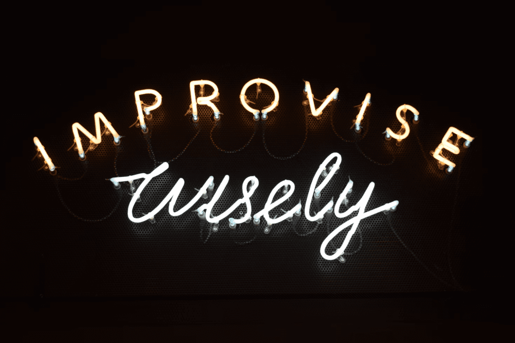
Photo by Valeriia Bugaiova on Unsplash
One of the quickest ways to lose your audience is by overcrowding your design with too much text. Visual communication, especially in infographics and presentations, should rely heavily on imagery and icons to convey messages succinctly and impactfully. Text should complement visuals, not overwhelm them. Remember, a picture is worth a thousand words; let your visuals speak volumes.
Beginners often feel compelled to explain every detail through text, but this approach can lead to cluttered and unengaging designs. Instead, use visuals to highlight key points and provide context. A well-chosen image or icon can often convey complex ideas more effectively than a paragraph of text.
Avoiding Common Mistakes for Beginners
2. Mismatching Fonts: The Perils of Overuse

Photo by Jon Tyson on Unsplash
Combining too many different fonts is a common mistake that can make a design look chaotic and unprofessional. Non-designers often fall into this trap, thinking that more fonts will add variety and interest. However, it usually results in a lack of cohesion and visual harmony.
To avoid this, limit your font choices to two or three complementary typefaces. Ensure they have distinct roles: one for headings, another for body text, and possibly a third for special elements like quotes or captions. Using a consistent typographic hierarchy helps create a clear, readable design that guides the viewer’s eye naturally.
Avoiding Common Mistakes for Beginners
3. Choosing the Wrong Colors: The Impact of Poor Color Selection

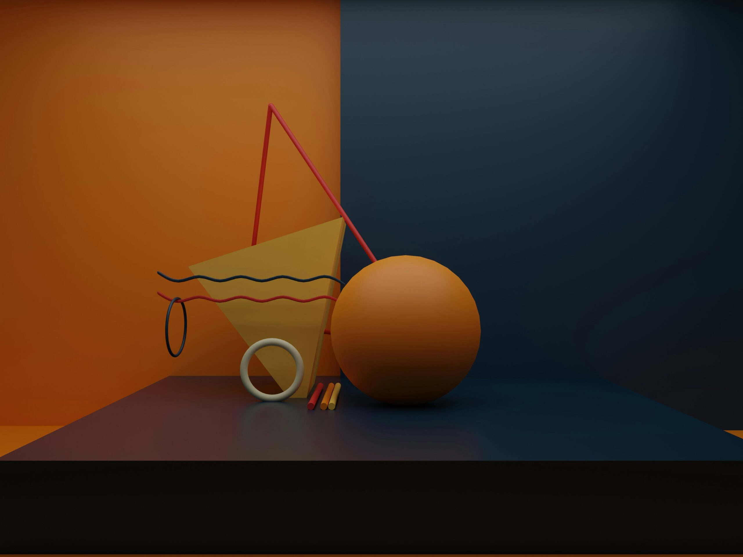
Photo by Patrick Robert Doyle on Unsplash
Color selection is one of the most crucial aspects of any design project. Poor color choices can derail a project with great potential, making it look unappealing or off-brand. Colors evoke emotions and set the tone for your design, so choosing the right palette is essential.
When selecting colors, consider the mood and message you want to convey. Use color tools and resources, like Adobe Color or Coolors, to find harmonious color schemes that suit your project’s needs. Additionally, be mindful of color contrasts to ensure readability and accessibility.
For more detailed guidance on color profiles, especially if you’re unsure about RGB vs. CMYK, check out our article on RGB vs. CMYK: Which Color Profile Should You Use?
Avoiding Common Mistakes for Beginners
4. Ignoring the Power of Negative Space
Negative space, or white space, is a critical component of good design. It refers to the empty areas around and between elements in a design. Beginner designers often overlook the importance of negative space, feeling compelled to fill every inch of the canvas with content. However, this can lead to cluttered and overwhelming designs.
Negative space should be viewed as a design element in its own right. It helps to create balance, focus attention, and enhance readability. A classic example of effective use of negative space is Google’s homepage, where the ample white space directs attention to the search bar, the main focal point.
Avoiding Common Mistakes for Beginners
5. Poor Scaling and Distorted Elements
Another frequent error is improper scaling of design elements, leading to distortion and loss of quality. Beginners might be hesitant to use large and small scale elements together, fearing they will upset the design’s balance. However, effective use of scale can add visual interest and hierarchy to your composition.
When scaling elements, ensure they are resized proportionally to avoid stretching or compressing them unnaturally. Vector graphics are particularly useful for scaling since they maintain their quality at any size. If you work with raster images, start with a high resolution to prevent pixelation when resizing.
Avoiding Common Mistakes for Beginners
6. Neglecting Visual Hierarchy Principles
Visual hierarchy is a fundamental design principle that guides viewers’ attention to the most important elements first. It establishes an order of importance through the use of size, color, contrast, and spacing.
For instance, in a well-designed poster, the main headline is usually the largest and most eye-catching element, followed by subheadings, and then the body text. This clear hierarchy helps the viewer understand the content at a glance. Beginners often fail to establish a strong visual hierarchy, resulting in designs where important information is easily overlooked.
Avoiding Common Mistakes for Beginners
7. Creating Hard-to-Read Text
The primary goal of any design is to communicate a message effectively. If your text is difficult to read, it fails to achieve this goal, regardless of how visually appealing the design might be. Factors such as font size, color contrast, and text alignment play crucial roles in readability.
Ensure that your text contrasts well with the background and is large enough to be read easily from a distance, especially in designs intended for posters or billboards. Avoid overly decorative fonts for body text and reserve them for headings or special accents.
Avoiding Common Mistakes for Beginners
8. Using Inappropriate Font Combinations

Photo by Marija Zaric on Unsplash
Pairing fonts effectively is an essential skill in design. Fonts have personalities and can evoke different feelings. Combining fonts that clash in style or mood can disrupt the overall harmony of the design.
Aim to pair fonts that complement each other and reflect the tone of the message. For example, combining a classic serif font with a modern sans-serif can create a balanced and sophisticated look. Experiment with different combinations but always strive for coherence and readability.
Avoiding Common Mistakes for Beginners
9. Misusing Raster Images
Raster images, composed of pixels, can become pixelated and lose quality when enlarged beyond their resolution. This common mistake leads to blurry and unprofessional-looking designs. Instead, use vector graphics whenever possible, as they are made of mathematical lines and curves that maintain their quality at any size.
If you must use raster images, ensure they are of high resolution and appropriately sized for your project. A good rule of thumb is to create your design at a larger size and scale down if needed, as reducing size maintains image quality, whereas enlarging does not.
10. Striving for Complete Symmetry
While symmetry can create a pleasing and balanced look, over-reliance on it can make your design appear dull and predictable. Perfect symmetry lacks the dynamic quality that can make a design stand out and engage viewers.
Don’t be afraid to experiment with asymmetry, which can add movement and interest to your compositions. Asymmetric designs can still achieve balance and harmony through thoughtful placement of elements and careful consideration of visual weight.
Enhancing Your Design Skills
Understanding these common mistakes is the first step toward refining your graphic design skills. Here are additional tips to help you grow as a designer and create compelling visuals:
Stay Updated with Design Trends
The design world is ever-evolving, with new trends emerging regularly. Stay informed about current trends by following design blogs, attending webinars, and exploring design portfolios. While it’s important not to follow trends blindly, being aware of them can inspire fresh ideas and keep your work relevant.
Seek Constructive Feedback
Feedback is invaluable for growth. Share your work with peers, mentors, or online design communities to gain different perspectives. Constructive criticism helps you identify areas for improvement and develop a more critical eye for your work.
Practice and Experiment
Design is a skill that improves with practice. Challenge yourself with different projects and experiment with various styles and techniques. Don’t be afraid to step out of your comfort zone; trying new things can lead to unexpected and rewarding outcomes.
Learn from the Best
Study the work of successful designers and analyze what makes their designs effective. Look at their use of color, typography, composition, and how they solve design problems. Learning from others can provide valuable insights and inspire your creative process.
Conclusion
Graphic design is a blend of art and communication, requiring both creativity and technical knowledge. By avoiding these common mistakes and continuously honing your skills, you can elevate your designs and effectively convey your messages. Whether you’re a beginner or a seasoned professional, embracing these principles will help you create compelling and impactful visuals that resonate with your audience.


This paragraph will help the internet visitors for setting up new blog or even a weblog from start to end. Ingrid Antoine Ferrel
Great post.
I am not sure where you’re getting your information
I’m really impressed with your writing skills
Greetings! Very helpful advice in this particular article! Rosana Broderick Rochella
I feel more equipped to tackle
Tips Are more Inspirational
Good To Read Waithing For More..
Helped me avoid mistakes I didn’t even know I was making
This article is a goldmine for beginners in graphic design
This article is a must-read for anyone serious about graphic design.
You have brought up a very good details , appreciate it for the post.
The tips on finding a design niche were insightful and motivating.
This article has given me a newfound enthusiasm for design
I feel more equipped to handle client feedback
Nice work!
Very nice write-up.
I’m excited to implement the advice on improving user interfaces.
Good Insprational artical
Very good point which I had quickly initiate efficient initiatives
I’ve already shared this article with my design team.
Good Artical Inspired to share
This article has given me a newfound enthusiasm for design.
The article’s structure makes it easy to follow and digest.
Great writting!
It’s clear the author knows their stuff—very authoritative.
Good!
Hi there, I enjoy reading all of your post. I like to write a little comment to support you.
This article challenged me to think differently about design.
I’m inspired to take more risks with my design choices.
I appreciate the practical examples provided throughout
Clear explanations make complex concepts easy to grasp
Helped me avoid mistakes I didn’t even know I was making
Good info. Lucky me I reach on your website
Helpful article, perfect for beginners in graphic design.
Informative content, essential for newcomers in graphic design.
Helpful tips for beginners navigating graphic design
This article challenged me to think differently about design.
The advice on building a design portfolio was spot-on.
I feel more prepared to tackle design challenges now.
I’m already seeing improvements in my design workflow.
It’s clear the author knows their stuff—very authoritative.
The troubleshooting section was incredibly helpful
I’m excited to see how my designs evolve after this
Good Artical!
The tips on client communication were unexpected but useful.
I appreciate the actionable steps provided throughout.
Reading this feels like having a one-on-one design consultation.
I’m impressed by the depth of knowledge shared here.
I’m excited to see how my designs evolve after this
I’ve taken notes that I’ll refer back to for sure.
This article is a great resource for design students.
I appreciate the practical examples provided throughout.
This article challenged me to think differently about design.
The advice on building a design portfolio was spot-on.
I feel more prepared to tackle design challenges now.
Great Artical
The article’s structure makes it easy to follow and digest.
I’m already seeing improvements in my design workflow.
It’s clear the author knows their stuff—very authoritative.
Great Artical
I like how the article addresses common design misconceptions.
The troubleshooting section was incredibly helpful.
This article has already saved me time in my design process.
This article challenged me to think differently about design.
Great Artical!
This article is a great resource for design students
I’m inspired to take more risks with my design choices
I appreciate the practical examples provided throughout.
I’m already seeing improvements in my design workflow.
Great Work!
I appreciate the actionable steps provided throughout.
Reading this feels like having a one-on-one design consultation.
I’m impressed by the depth of knowledge shared here
The section on vector graphics was a revelation for me
I’ve taken notes that I’ll refer back to for sure.
The tips on client communication were unexpected but useful.
I’m eager to dive deeper into each topic covered here.
The visuals in the article really enhance understanding.
The advice on design software was incredibly helpful.
This article reaffirmed my passion for graphic design
I’ve already started applying these tips to my portfolio
The section on color theory clarified a lot for me.
I’m inspired to experiment more with design elements
I appreciate the actionable steps provided throughout.
The tips on finding inspiration were practical and inspiring.
Reading this feels like having a one-on-one design consultation.
The advice on project management was unexpectedly valuable
I’m impressed by the depth of knowledge shared here
This article motivated me to refine my design portfolio.
I appreciate the author’s clear and concise writing style.
This article is a great starting point for aspiring designers
The section on vector graphics was a revelation for me
I’m excited to see how my designs evolve after this
I’ve taken notes that I’ll refer back to for sure
Great Artical!
I like how the article balances theory with practical tips
The tips on client communication were unexpected but useful
It’s encouraging to see my design skills improving already
I’m eager to dive deeper into each topic covered here.
The visuals in the article really enhance understanding.
I feel more confident about choosing design elements now.
Great for self-taught designers looking to level up
Nice Work!
I appreciate the focus on both digital and print design
The advice on design software was incredibly helpful.
This article reaffirmed my passion for graphic design.
Reading this article feels like a mini design workshop.
The section on layout design was particularly insightful.
Nice Artical!
I’ve already started applying these tips to my portfolio.
Nice Artical!
Very Informative!
It’s clear the author knows their stuff—very authoritative.
This article has already saved me time in my design process.
I appreciate the actionable steps provided throughout
Good!
Good artical!
I’m already seeing improvements in my design workflow
I appreciate the practical examples provided throughout
The tips on creating mood boards were incredibly useful
I’m grateful for the recommendations on design books and resources
Great Artical!
I appreciate the practical tips on file management
Good to read
This article has broadened my understanding of graphic design
I like how the article encourages creativity in design.
The article’s insights will undoubtedly benefit my career.
I’m grateful for the recommendations on design books and resources
The tips on creating mood boards were incredibly useful
I’m inspired to take more risks with my design choices
I feel empowered to experiment with different design styles
I love how the article breaks down complex concepts.
A must-read for anyone serious about improving their design skills.
The section on color theory clarified a lot for me.
Has a Lot Of Information!
Nice Artical!
I’m inspired to experiment more with design elements.
Good Informative..
This article makes learning graphic design enjoyable and accessible.
I’ve shared this with my classmates—it’s that good!
Practical advice that’s relevant to real-world projects.
The tips on typography alone are worth the read.
I wish I had found this sooner—it’s a game-changer.
I’ve bookmarked this article for future reference.
Helpful for anyone starting out in graphic design.
Insights that will definitely improve my design work.
I feel more equipped to tackle my next design project.
This article has given me confidence in my design decisions.
Good Artical
It’s like having a mentor guide you through the basics.
I appreciate the emphasis on foundational skills and principles.
Great examples that illustrate each point effectively
Clear explanations make complex concepts easy to grasp.
Helped me avoid mistakes I didn’t even know I was making.
Practical tips that are easy to understand and apply.
This article is a goldmine for beginners in graphic design!